Naming & Design

Naming
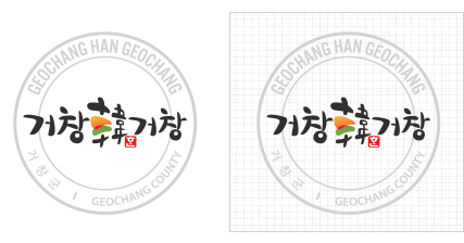
- It represents Geochang as the Korea's greatest and the most superb city.
- The county's name 'Geochang' and the adjective 'geochanghada' meaning 'great' are mixed to create a double meaning and to desribe Geochang.
- The county's name 'Geochang' and its great agricultural products are expressed together with the logo.
- The letter 'Han(韓)' which means 'Korea' or 'nation' was placed at the center to express the county' will to pursuit the country's best local government and also to create flexible and highlighting visual effect.
Design
The orange color represents Geochang's golden field full of ripe crops and the green represent Geochang's clean natural environment. The red which is the mixture of green and orange colors, symbolizes Geochang's passion and bright future. Overall, the design gives an active image of Geochang and the county's image of future-oriented development.
Emblem
The emblem can be applied to mediums that require decoration, formality and quality. It can be used selectively depending on the applied space but it can't be used with the proportion and spacing modified.

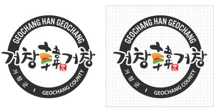
Signature
The signature system is an organized and effective mixture of the symbol mark and logo type and it is the combination guideline set up to establish the visual unity of images. The signature can be used selectively depending on the applied space and can also be used by modifying the proportion and spacing but the identity of the signature shall not be harmed. The details of its application must be according to the suggested examples by item.
Applied font: Nanum Brush Script * The suggest proportion must be applied to other product names as well.
- Geochang-gun's integrated brand "Geochang韓Geochang" is a marked registered with the Korean Intellectual Property Office under the patent law and you must consult with the relevant department to use this brand for the purpose of promoting Geochang County or of public use.
- nquiry : Planning and audit division of Geochang-gun office +82-55-940-3033
Footer Information
![]()


